I know I said I’m busy and wouldn’t be posting, but courtesy of an Ace of Spades post I read this morning, I couldn’t ignore one of the greatest examples of fraudulent charting I’ve ever seen.
Here’s the back-story: recently Twitter slapped “state-funded media” labels (and variants thereof) on the profiles of media organizations that are… wait for it… state funded.
PBS and NPR were so offended that they terminated their Twitter feeds.
The Canadian Broadcasting Corporation (or CBC) quickly followed suit, issuing a bold statement (the domestic equivalent of a “strongly worded letter”) in which they asserted their rigorous independence.
“We are beholden to no one!” they proclaimed, among other expressions of indignation.
According to Twitter, “government-funded” is defined as “outlets where the government provides some or all of the outlet’s funding and may have varying degrees of government involvement over editorial content.”
Not very controversial: “government-funded” means “government-funded,” and anyone government-funded might find some strings attached to that funding.
While CBC/Radio-Canada is publicly funded through a parliamentary appropriation voted upon by all members of Parliament, the government has no — zero — involvement in our editorial content or journalism.
We cannot in good conscience continue to post fact-based news and information to Twitter, or engage on it, while a false impression of government involvement in our work is allowed to stand. As a news organization committed to truth, facts and accuracy, we cannot abide by a label that promotes disinformation about who we are and what we do.
I don’t see a “false impression” being suggested by Twitter: like I said, there’s just a perfectly reasonable suggestion that entities funded by governments may be subject to government meddling. I could take CBC more seriously if they’d objected to similar “warnings” being applied to other entities in the past, but of course they haven’t because it was mainly their ideological enemies being labeled.
Besides, and more importantly, as Ace’s post makes clear, the CBC are not themselves unwilling to “promote disinformation” about who they are and what they do.
Consider this graphic from their own website:
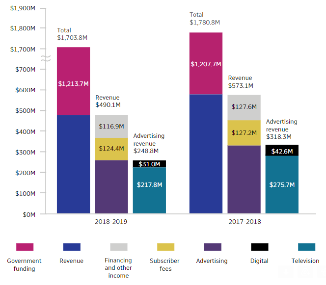
A quick visual scan of this graphic suggests that the purple column segments representing government funding aren’t that big a deal. You have to note the treacherous and deceptive little break in the y-axis, which obliterates the gap from 700 million to 1700 million (Canadian) dollars.
Ace uses the Seinfeld “yadda yadda yadda” motif to make his point—first explaining the “yadda yadda yadda” motif, then saying:
The CBC—a media organization which attempts to quash the free speech rights of citizens by claiming they’re engaging in “disinformation”—just yadda yadda yadda’d a billion f***ing dollars.
Just so.
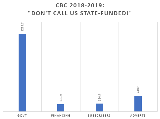
To get a sense of just how badly the CBC misrepresents things with these charts, I spent three minutes plugging the numbers into Excel to produce two more accurate representations.
First another column visualization:
And then a simple pie chart:
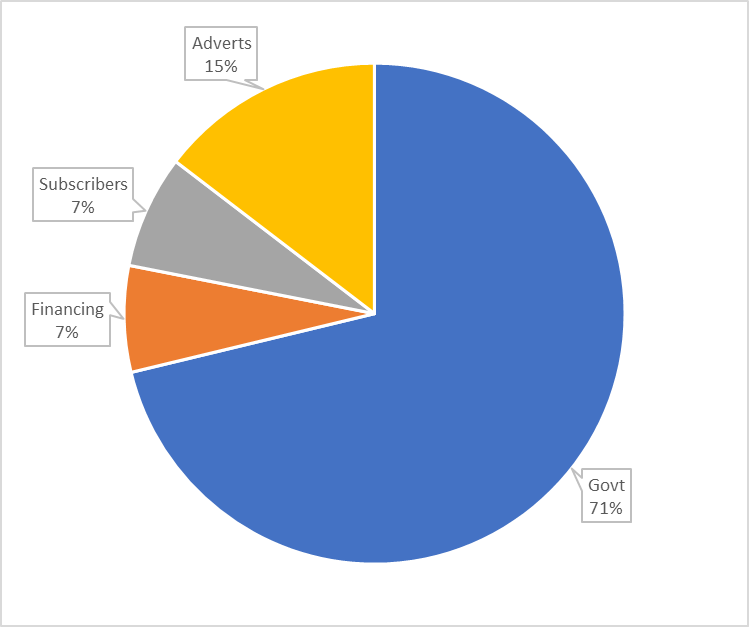
Tells a slightly different visual story, doesn’t it?
In my pie chart, based on the same exact numbers used by the CBC on their own website (for the 2018-2019 numbers on the left side of their twin graphs), the government is a giant Pacman gobbling up the other slices.
In my column chart, the government is a giant Redwood towering over a bunch of little Bonzai trees.
Note also that the CBC is showing two charts: one on the left, one on the right.
It gives the visual impression that government funding is decreasing and non-government funding is increasing. Right? Because your eyes tell you the purpleness on the left is smaller than the purpleness on the right.
Because the fuckers put the chart in the wrong order.
They put the more recent data (2018-2019) on the left and the older data (2017-2018) on the right.
Who does that?
In fact, government funding was 67.8% of total revenue in 2017-2018, and 72.2% in 2018-2019. Government-funding increased as a share of total revenue…. by 5.04%.
My charts and stats are accurate. Take the numbers from the CBC and chart them yourself in Excel, you’ll get the same diagrams, the same percentages.
Note also that there’s no reason not to illustrate the data my way. I’ve been working with and creating data visualizations in the private sector as a part of my job for my entire professional life, and my charts are the normal way this kind of data would be presented in any industry with which I’ve ever had anything to do (finance, media, insurance, travel, healthcare, gaming, education, etc).
“Broken” value axes are usually only used when one number is so wildly out of proportion to the rest that scale has to be violated to make the other numbers show up as something more than a flat line: in such cases, however, one generally brings it to the reader’s attention.
When values fluctuate a lot—when it’s not just one distorting value but a whole bunch of redwoods mixed in with a whole bunch of bonzais—you can use logarithmic scaling to achieve the same kind of visual smoothing.
There’s no need for any of that with these numbers. Even slicing the advertising into its Online and TV components, the pie chart still has discernible slices for every type of revenue:

See?
It works with columns, too: no flat lines.
And, again, who the hell lays out data visualizations so that time goes from right to left?
The only reason to present the numbers the way the CBC chose to is to mislead. To confound. To disinform.
And they have the balls to say that Twitter’s perfectly reasonable definition of “government-funded” media is misinformation?
The definition of chutzpah needs another update.
If you engage in blatantly outrageous attempts at subterfuge when protesting your innocence, it seems reasonable to suspect that you may in fact not be innocent, yes?