
Most Danes are familiar with Statens Serum Institut. It maintains the COVID-19 Dashboard that many of us use to keep track of the pandemic in Denmark.
The dashboard looks like this (as of 13:45 on Saturday, 28 November):

It’s a lot of data. I’ve gotten to checking it once a day after its 14:00 update to see the new daily case count. We’ve been bouncing around between 1100 and 1400 new cases per day for several weeks now. We’re told that’s “serious but stable.”
There was a little bit of a kerfuffle in the states on Friday because Johns Hopkins University, the organization behind the most widely used COVID-19 dashboard in the United States, published and then retracted a paper that could be interpreted to suggest that COVID deaths were “eating into” deaths from heart disease, and that excess mortality in the United States overall was not alarming. I’m being careful in my language here by design: the paper wasn’t taken down because it was a bad paper full of bad data, but because it could be interpreted to suggest things that apparently ought not to be suggested.
Though making clear the need for further research, the article was being used to support false and dangerous inaccuracies about the impact of the pandemic. We regret that this article may have contributed to the spread of misinformation about COVID-19.
— JHU News-Letter (@JHUNewsLetter) November 26, 2020
Note in particular (my emphasis): “Though making clear the need for further research, the article was being used to support false and dangerous inaccuracies about the impact of the pandemic.”
This is dumb for many reasons, but I don’t want to waste time on that. I’d like instead for my Danish readers to join me in exploring what the excess mortality rates for Denmark are telling us right now.
So let’s have a look:
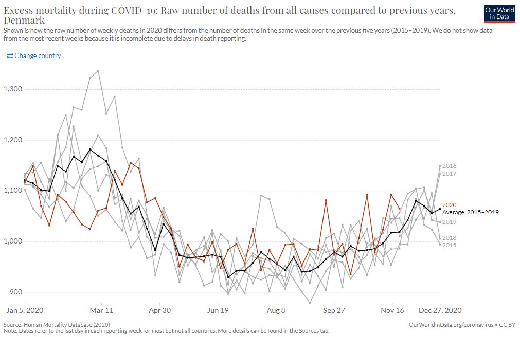
It’s tough to make out at that resolution, so here’s a link to the site.
Each line represents the weekly mortality counts for one particular year. There’s one line for every year from 2015 to 2020. The bold black line in the middle is the average for the years 2015-2019.
Even at this low resolution, you ought to be able to notice a couple of things.
First, you’ll notice the only real anomaly is in the upper left, where 2018 mortality spikes much higher than the average for the period.
Second, you’ll notice another gray line spiking a little less dramatically in August. That’s also 2018.
Third, you’ll notice that the red line representing 2020 starts the year well below the period average, but that although there are some other below average periods after that, the red line runs a little over average most of the rest of the year.
You’ll also notice, if you’re used to dealing with mathematical sleights of hand, that the x-axis is set at 900 rather than zero. I found that interesting (and suspicious), so invested a few minutes into downloading the data, pulling it into a spreadsheet, and generating a chart built off the exact same data but with zero as its baseline.
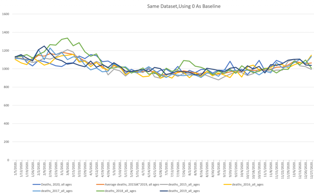
The details also get lost at this resolution, but ask yourself: do you see anything inherently alarming about the number of Danes dying each week from 2015-2020?
Personally, I’d say, “Looks like 2018 was a particularly nasty flu.”
And that’s it.
Before I get called a denialist or simpleton or enemy of science, I acknowledge that we have no control group for 2020. We cannot see what the 2020 excess mortality might have looked like had we not had all these social controls forced upon us.
But lets look back at the American mortality rates from the same source:
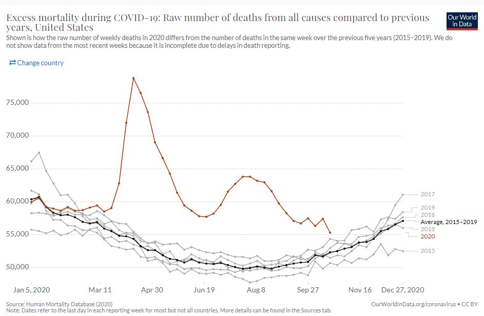
Wow, the red 2020 line really jumps out at you!
Let’s have a look with a zero baseline:

The 2020 line (blue) still jumps out, but you have to admit it’s not quite as dramatic, especially if you’re aware of the catastrophic nursing home deaths in New York that Andrew Cuomo enabled in the spring. Sending COVID positive patients back into nursing homes unequipped to isolate those patients adequately may have been the single most irresponsible and deadly decision made by any politician in any country, apart from the CCP’s having let it out of China in the first place and then lying about its potential for human-to-human transmission.
But even subtracting the 15-20,000 (at minimum) New York nursing home deaths from the March and April figures, you’ve still got a markedly elevated 2020 line.
In America.
Where lockdowns in most population centers have been much more dramatic than what we’ve endured in Denmark: both more severe and longer lasting.
You can play with the OurWorldInData mortality charts for hours. There are many interesting observations to be had. But let’s look at one more chart in particular:

This is looking at excess mortality of 2020 as a percentage difference from the 2015-2019 period. The zero baseline is in the middle (vertically): points below represent lower than average total mortality, points above it represent higher than average mortality.
The U.S. has been experiencing almost 15% more deaths than usual over the last few months: Sweden had a rough summer, but has been declining since and is only about 5% higher than the period average now. Denmark and Norway appear to have seen fewer deaths in 2020 than they did in the period 2015-2019. It’s actually been a good year for us.
It’s going to be a long time before we really understand the real impact of this pandemic, and there are a lot of questions we’ll need to answer.
It’s not going to help that effort if academic organizations are going to publish or censor papers based on what those organizations believe can and cannot properly be deduced from their findings.
Final Note: The witching hour of 14:00 came and went while I was writing this, and today’s new case count jumped up to 1636. I think that’s a new record for Denmark. But does a record case count really matter if the overall number of deaths in the country is entirely normal for this time of year? Is actually better than the average over the previous five years?